
I'm Gary Meyer. I'm a Senior UX Designer based in Raleigh, NC, currently consulting with a varitey of organization types and sizes at Insight.


Discovery, alignment, & website design for MHI.org
View Project
Strategy, Alignment, Experience design, Interface design, User Testing, and Validation for Progressive
View Project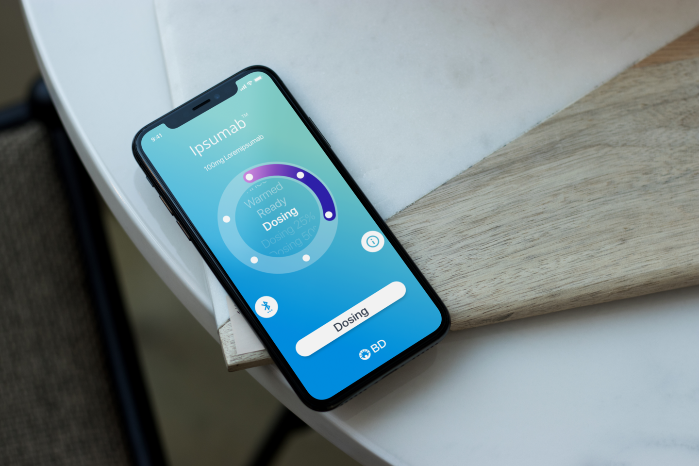
Alignment, Experience design, Interface design, and Interaction design for BD
View Project